By
Published on Oct 13, 2020 in General
For more than twenty years, New Jersey Policy Perspective (NJPP) has researched and reported on the biggest policy issues in the Garden State. From abolishing the death penalty, to enacting earned sick days and a $15 minimum wage, to creating a fairer tax code, NJPP has analyzed and developed innovative policy ideas that advance economic, social, and racial justice for all.
Over this time, many things have changed — at NJPP, in the halls of the State House, and beyond — but some things have remained the same. One constant is that design matters, whether it’s how New Jersey’s primary ballots are organized, how tax policy is written, or how we present our work to the world.
This is precisely why we are so excited to unveil a new visual identity, and website, for NJPP.
NJPP’s blue checkerboard logo served the organization well, but we knew that we needed a new look that better reflects our values, our work, and our vision for the future.

We needed a redesign that would both reflect and amplify who we are and what we do best: research and report on the most pressing issues facing the people of New Jersey, and promote bold policy solutions to ensure everyone in our state — regardless of who they are — has a thriving future.
The result is a new look as clear and concise as our research and analyses; as bold as our policy solutions; and as adaptable to a constantly changing landscape as our staff consistently shows themselves to be.
The New Look: Clear and Concise, Bold and Adaptable
Our new visual identity, designed in-house by Communications Director Louis Di Paolo, draws on NJPP’s history and our emphasis on facts and figures — and math.

The new logo represents an intentional evolution of our visual identity. Replacing the blue graph paper are two blue bars, similar to those you will find in our reports and analysis. The logo is simple and easily recognizable, scalable (read: can work at small sizes), and can be adapted to placement on a range of backgrounds for presentation in multiple formats.

For smaller applications (looking at you, Twitter), we designed a companion logo using NJPP’s initials. Here, the blue bar underlines NJPP, representing how our work always rests on a strong foundation of research — it’s our goal to ground policy debates in hard facts and figures. The logo’s narrow typeface, DIN Condensed Bold, shows that we’re not afraid to stand tall to promote our findings, whether it be in legislative committee hearings, out in the community, or on the opinion pages of the state’s largest media outlets.

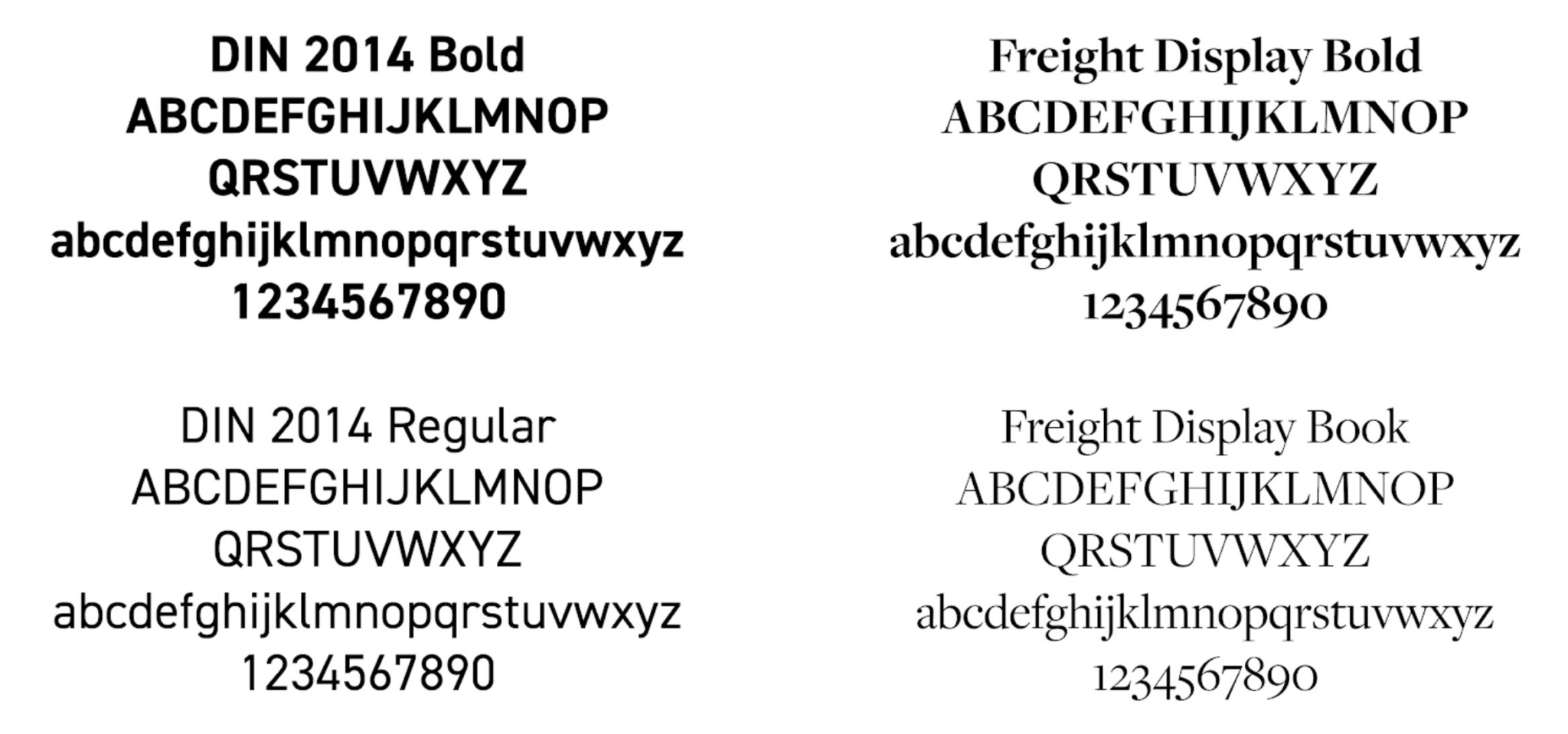
Our new fonts, DIN 2014 and Freight Display, were picked both for their looks (Louis is a sucker for chunky serif fonts) and for their functionality. Like NJPP’s research — which isn’t meant to sit on a shelf, but influence public policy decisions — these typefaces serve a purpose. The DIN font family, which was originally designed in 1931 for use in engineering and technical applications, is minimally designed and easily readable on screens. The Freight Display font family not only has a great name that harkens to New Jersey’s robust transit infrastructure, but it embodies a humanist design that is easily readable as body text.
The Website
Designed by the amazing team at Bixler Creative, NJPP’s new website utilizes a minimalist color palette that draws on New Jersey’s official state colors — Jersey blue and yellow — with photos that reflect the true diversity of the Garden State. The site also makes it much easier to navigate through our publications, from reports and explainers to our weekly Friday Facts and Figures digital newsletter.
Based on feedback from readers like you, we made a real effort to prioritize accessibility, so grassroots activists, lawmakers and staff, and members of the media alike can find what they’re looking for, whether it’s on our individual issue pages or using the new search feature on our publications page. We have also curated a list of Key Resources, which includes some of the most requested and referenced NJPP publications of the last few years.
Design Matters
Design matters. It also isn’t easy. Creating a new visual identity that better reflects our values was a multi-year project that truly benefited from the dedication of NJPP staff, past and present, and input from the NJPP extended family. This was a big priority of mine when I took over as President of NJPP; it was also a big goal for Louis from the day he joined the team (he has dozens of “NJPP New Logo Draft” Adobe Illustrator files piled up on his desktop to prove it).
We hope our new look—and website—serves you well in our shared pursuit of racial, economic, and social justice. Thank you.

